CREATE FLOW (PROMOTION FLOWS)
The Create Flow (Promotion Flows) panel opens when the function is selected from the Promotion FLOWS panel. It is used to configure a new kiosk promotion workflow.
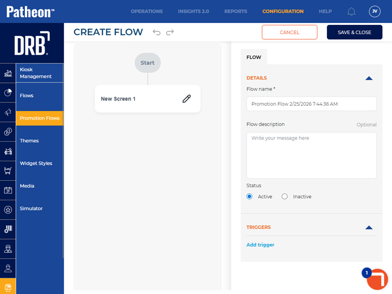
FLOW
DETAILS
The Details section provides basic settings for the promotion flow, including its name, an optional description, and its status.
Flow name*
Name of the workflow.
Flow description
A user-configured summary of the workflow.
Status
An organization can control whether its sites can use a workflow by its Status setting.
|
Value |
Description |
|
|
Status required to use a workflow. Also required to assign the flow to a site. |
|
|
The workflow can't be assigned to a site. |
 Active
 Inactive
TRIGGERS
A condition that initiates a specific set of actions automatically.
NEW SCREEN 1
The New Screen 1 configuration settings opens after selecting the edit function below Start.
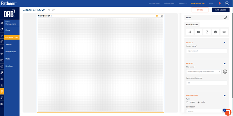
DETAILS
Screen name*
Name of the screen.
ACTIONS
Play sound
Sound that plays when the screen is activated.
Set timeout (seconds)
Duration inactivity (in seconds) before the flow restarts.
BACKGROUND
The Background section provides the ability to configure the screen's background.
Type
The Type setting provides the ability to specify whether the screen's background should use an image or solid color.
Image
Image that displays in the background of the screen.
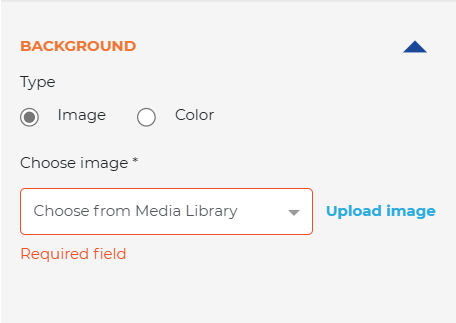
Choose image*
The Choose image* setting provides the ability to select a background image from the Media Library, or upload a new image.
Color
The Color setting provides the ability to configure the screen background with a solid color.
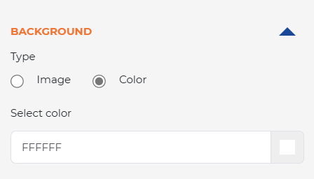
Select color
In Select color, enter a Hex code color value, or use the color picker to choose a color.
NEW SCREEN 1: WIDGET
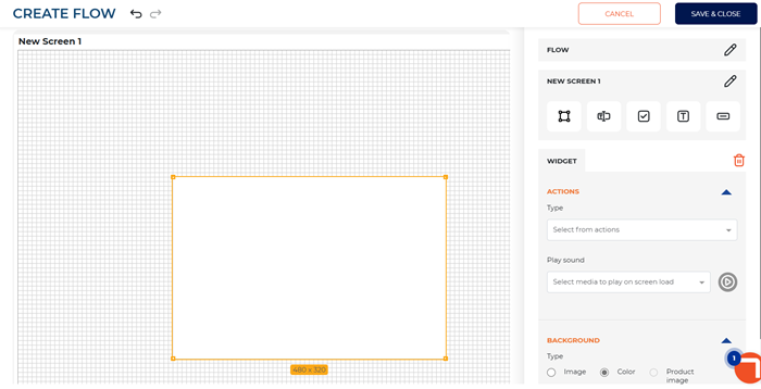
ACTIONS
Type
Select the promotion type for the flow.
- Purchase Plan
- Purchase Wash
Purchase Plan
If flow is for purchase plan, select the plan to purchase.
Purchase Wash
If flow is for purchase wash, select the wash to purchase.
Play sound
Sound that plays when the widget is activated.
BACKGROUND
Type
Select the type of background for the widget.
- Image
- Color
- Product image
SETTINGS
X
Horizontal position of the widget on the screen.
Y
Vertical position of the widget on the screen.
Width (px)
The width of the widget in pixels.
Height (px)
The height of the widget in pixels.
Corner radius (px)
Measurement that defines how rounded the corners of the widget appear on the screen (in pixels).
Opacity (%)
Transparency level of the widget on the screen (in percentage).
Border Color
Color of the widget's border.
Border Size (px)
Width of the widget's border (in pixels).
NEW SCREEN 1: INPUT
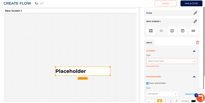
ACTIONS
Type
Select the input type for the flow.
- Mobile Number
PLACEHOLDER
Show placeholder
Select to display the placeholder on the promotional flow screen.
Font
Font type, size, color, and alignment of the text in the placeholder.
SETTINGS
X
Horizontal position of the placeholder on the screen.
Y
Vertical position of the placeholder on the screen.
Width (px)
The width of the placeholder (in pixels).
Height (px)
The height of the placeholder (in pixels).
Corner radius (px)
Measurement that defines how rounded the corners of the placeholder appear on the screen (in pixels).
Border Color
Color of the placeholder's border.
Border Size (px)
Width of the placeholder's border (in pixels).
Required*
Uncheck if the user input for the placeholder is not required.
NEW SCREEN 1: CHECKBOX
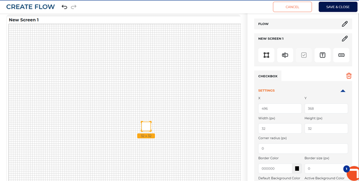
SETTINGS
X
Horizontal position of the checkbox on the screen.
Y
Vertical position of the checkbox on the screen.
Width (px)
The width of the checkbox (in pixels).
Height (px)
The height of the checkbox (in pixels).
Corner radius (px)
Measurement that defines how rounded the corners of the checkbox appear on the screen (in pixels).
Border Color
Color of the checkbox's border.
Border Size (px)
Width of the checkbox's border (in pixels).
Default Background Color
Color of the checkbox when it is unchecked.
Active Background Color
Color of the checkbox when it is checked.
Checkmark color
Color of the checkmark that displays in the checkbox.
Required*
Select if the user input for the checkbox is required.
NEW SCREEN 1: TEXT
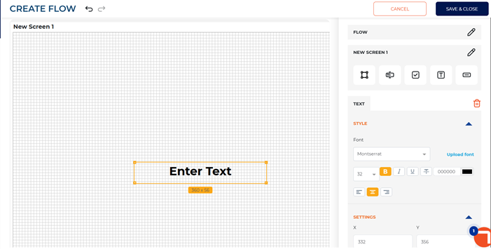
STYLE
Font
Font type, size, color, and alignment of the text.
SETTINGS
X
Horizontal position of the checkbox on the screen.
Y
Vertical position of the checkbox on the screen.
Width (px)
The width of the checkbox (in pixels).
Height (px)
The height of the checkbox (in pixels).
NEW SCREEN 1: BUTTON
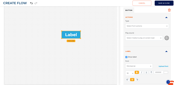
ACTIONS
Type
Type of action user is prompted to take on the screen.
- Navigate Forward
- Navigate Back
- Submit Form
- Decline Form
LABEL
Show label
Uncheck if the button label should not display on the screen.
Font
Font type, size, color, and alignment of the button label.
BACKGROUND
Type
Type of background for the button label.
- Image
- Color
Choose image*
If background type selected is image, select the image from the media library to display on the screen.
Select color
If background type selected is color, select the color of the button label.
SETTINGS
X
Horizontal position of the button on the screen.
Y
Vertical position of the button on the screen.
Width (px)
The width of the button (in pixels).
Height (px)
The height of the button (in pixels).
Corner radius (px)
Measurement that defines how rounded the corners of the button appear on the screen (in pixels).
Border Color
Color of the button's border.
Border Size (px)
Width of the button's border (in pixels).